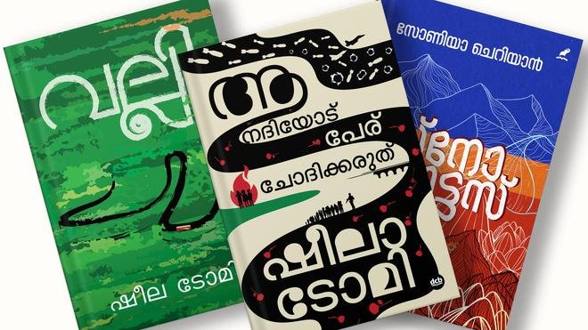
For many readers, a book begins before the first sentence. It begins with an image, a colour, a typeface and the physical object held in the hand. Kerala artist Arun Gokul believes that this first encounter deserves to be treated as art in its own right.
Gokul has designed the covers of several bestselling works in Malayalam literature, bringing an artistic sensibility to an area of publishing that is often treated as a purely commercial or functional exercise. His work raises a larger question about the relationship between book cover design and literature: can the outside of a book communicate something as profound as the words inside?
In Malayalam publishing, where literature has a strong visual and cultural identity, the answer can be particularly significant. A thoughtfully designed cover can establish a book’s mood, create curiosity and give readers an immediate visual entry point into a story or collection of ideas.
Why does a book cover matter?
A book cover performs several jobs simultaneously. It identifies the title and author, provides a visual identity for the work and competes for attention in a crowded publishing environment.
But an effective cover does something more subtle. It creates an emotional expectation.
A dark, restrained design may suggest mystery or psychological depth. A bright palette can communicate energy or humour. Minimal typography can suggest seriousness, while an elaborate illustration may hint at fantasy, history or a richly layered narrative.
The best covers do not necessarily explain the entire book. Instead, they create a question in the reader’s mind.
What is this story about?
That curiosity can be the beginning of the reading experience.
Arun Gokul’s approach places design alongside literature
Gokul’s work is notable because it treats the cover as more than packaging. His artistic approach suggests that a cover can become an independent visual interpretation of a literary work.
This is particularly challenging because the designer must respond to another artist’s creation. A writer communicates through language; the cover artist communicates through visual elements.
The two forms of expression must coexist without one overpowering the other.
A successful cover therefore requires more than drawing ability. It involves reading, interpretation, visual composition, typography, colour theory and an understanding of how readers perceive images.
The cover artist is an interpreter, not simply an illustrator
One of the most important distinctions in contemporary book design is the difference between illustration and interpretation.
An illustration may depict a specific scene from a story. An interpretive cover can go further by capturing an idea, emotion or tension at the heart of the book.
Imagine a novel about memory. A literal cover might show a character looking at an old photograph. A more conceptual approach might use fragmented typography, faded colours or overlapping images to suggest how memories become incomplete over time.
The second approach does not reproduce the story. It translates its emotional language into visual language.
This is one reason an aesthetically strong book cover can function as a work of art independently of the text it represents.
Malayalam literature offers a rich visual landscape
Malayalam literature has an especially diverse relationship with visual culture. Its literary traditions encompass novels, short stories, poetry, memoirs, political writing, folklore and contemporary experimental works.
That diversity creates opportunities for designers to explore very different visual styles.
A historical novel may require a visual vocabulary rooted in a particular period. A contemporary literary work may benefit from abstraction and minimalism. A political book may use typography as its strongest visual element, while a collection of poetry might depend on atmosphere and negative space.
The cover therefore becomes an extension of the book’s identity.
What makes an aesthetically designed book cover successful?
There is no single formula for a great cover, but several principles repeatedly appear in effective book design.
- Concept: The design should have an idea behind it rather than simply decorative imagery.
- Typography: The title and author’s name must remain readable while contributing to the overall composition.
- Colour: The palette can establish mood and help a book stand apart.
- Composition: Images, text and empty space need to work together.
- Originality: The design should have a recognisable identity rather than copying familiar publishing trends.
- Connection to the book: A cover should feel relevant to the work without revealing everything about it.
These elements may appear technical, but their combined effect is emotional. Readers often respond to a cover before consciously analysing why they like it.
The psychology of the first impression
Readers encounter hundreds or thousands of visual signals every day. Bookshops, online marketplaces, social-media posts and publishing catalogues all rely heavily on visual presentation.
A cover therefore has only a limited amount of time to communicate its identity.
This is particularly important in the digital age. On a physical bookshelf, readers can pick up a book and inspect its texture, size and typography. Online, a cover may first appear as a small thumbnail on a screen.
That means modern book designers have to create work that functions at different scales.
A cover should look compelling as a physical object but remain recognisable when reduced to a small digital image.
Why minimalism can be harder than elaborate design
One of the misconceptions about book-cover design is that complexity automatically means artistic sophistication.
In reality, minimal covers can be among the most demanding to create.
When a design contains only a title, one image and a restrained colour palette, every element becomes important. A slight change in spacing, font size or alignment can alter the entire composition.
Minimalism also requires confidence. The designer must understand what can be removed without weakening the message.
In this sense, an effective book cover is often an exercise in editing.
Typography can become part of the artwork
Typography is sometimes treated as secondary to illustration, but in book design the lettering itself can become a visual element.
The shape of Malayalam script presents particularly interesting possibilities for designers. The curves, rhythm and density of the script can influence the entire composition of a cover.
A designer can use typeface, scale, spacing and placement to establish personality without adding another illustration.
This is especially useful for literary books where restraint may be more appropriate than an elaborate image.
The challenge of designing for a bestseller
Designing the cover of a bestselling book involves a difficult balance between artistic freedom and commercial expectations.
The cover must appeal to readers, fit the publisher’s identity and work within the practical requirements of printing and distribution. At the same time, it should preserve the distinctiveness of the literary work.
A successful cover can even become associated with the book itself.
Readers may remember a novel through its colours or visual motif years after reading it. The cover becomes part of the cultural memory of the work.
When the cover becomes part of the book’s identity
Some book covers are so closely associated with their titles that they become instantly recognisable.
This is the point at which cover design moves beyond marketing.
The image becomes an independent symbol of the literary work. It can appear in reviews, social-media discussions, posters, literary festivals and adaptations. In such cases, the cover is no longer merely something that protects the pages.
It becomes part of how readers remember the book.
Book cover design in the age of social media
Digital publishing has made visual identity even more important.
Readers increasingly discover books through social media, online bookstores, literary websites and recommendation feeds. In these environments, a cover is often the first and sometimes the only visual information available before a reader decides to investigate further.
This creates a new challenge for artists such as Gokul.
A design must work on the physical book, but it also needs to survive the digital environment of thumbnails, screenshots and mobile displays.
The most successful covers can achieve both: they have enough detail to reward close viewing while retaining a strong silhouette or visual concept at smaller sizes.
Can a book cover influence what readers expect?
Absolutely.
Readers often make assumptions about genre, tone and audience from visual design before reading the description.
A cover that looks academic may attract a different audience from one that looks playful. A stark literary design can signal seriousness, while an illustrated cover may suggest accessibility or popular fiction.
This means designers have a responsibility beyond making something beautiful. They also shape the reader’s expectations.
The strongest work manages to create expectations without making misleading promises.
Why the artist’s role deserves greater recognition
Writers are naturally placed at the centre of literary culture. Their names appear prominently on books, reviews and awards. Cover artists, however, can remain invisible even when their work becomes one of the most recognisable aspects of a publication.
Gokul’s perspective draws attention to this often-overlooked creative role.
A cover artist reads the manuscript, discusses the work with publishers or editors, develops concepts and transforms an abstract literary experience into a visual object.
That process is a form of interpretation.
Recognising it as such can broaden the way readers think about the publishing ecosystem. A book is not created by the writer alone. Editors, designers, illustrators, translators, typesetters, printers and publishers all contribute to the final object.
The future of book covers: physical art meets digital discovery
The future of book design is likely to become increasingly hybrid.
Physical books will continue to depend on tactile qualities such as paper, printing, colour and finishing. At the same time, digital discovery will demand covers that perform well on screens.
This could encourage designers to think about covers as flexible visual identities rather than static images.
A strong cover might appear on a physical book, an audiobook thumbnail, an e-commerce listing, a social-media campaign and a literary event poster while maintaining a consistent identity.
The challenge will be preserving artistic depth while meeting the demands of fast-moving digital publishing.
What Arun Gokul’s work says about Malayalam publishing
The growing attention to Gokul’s work points to something larger than one artist’s career. It reflects an appreciation for the visual dimension of Malayalam publishing.
When publishers invest in thoughtful cover design, they acknowledge that readers experience literature through more than words. The physical appearance of a book can influence discovery, expectation and memory.
For Malayalam literature, this visual identity can also become a way of connecting contemporary publishing with Kerala’s broader artistic traditions.
That makes the book cover more than a commercial surface.
It becomes a meeting point between literature, graphic design, illustration and visual culture.
Conclusion: A book can begin telling its story before the first page
Arun Gokul’s approach to book-cover design challenges the idea that the cover is merely packaging. When an artist carefully considers imagery, typography, colour and composition, the cover can become an interpretation of the literary work and an artwork in its own right.
For Malayalam literature, where books continue to occupy an important place in cultural life, this visual dimension deserves greater attention. A beautifully designed cover can attract a reader, create curiosity and eventually become inseparable from the memory of the book itself.
The most successful cover may not tell readers exactly what they will find inside. Instead, it invites them to look closer.
And perhaps that is the essence of good art: it does not give everything away at first glance; it makes you want to discover more.
Frequently Asked Questions
Who is Arun Gokul?
Arun Gokul is a Kerala-based artist and book-cover designer known for creating covers for works in Malayalam literature, including books that have gained significant readership.
Why is book-cover design considered an art?
A book cover can involve concept development, illustration, typography, colour theory and composition. When these elements interpret the ideas or emotions of a literary work, the cover can function as an independent visual artwork.
What makes a good book cover?
A good book cover usually combines a strong concept with effective typography, appropriate colour, balanced composition and a visual connection to the book’s subject or mood.
How does a book cover influence readers?
A cover creates an immediate visual impression and can influence expectations about a book’s genre, tone and content. It can also encourage readers to investigate a title further.
Why is typography important in Malayalam book covers?
Malayalam script has distinctive visual characteristics, including its rounded forms and flowing structure. Typeface selection, spacing and placement can therefore become important parts of a cover’s artistic composition.
Has digital publishing changed book-cover design?
Yes. Books are increasingly discovered through online stores and social media, so covers must remain visually effective both as physical objects and as small digital thumbnails.
Is a book cover only a marketing tool?
No. Although a cover has an important commercial function, it can also establish a book’s visual identity, communicate mood and become part of how readers remember the work.
Why is cover art important to Malayalam literature?
Thoughtful cover art adds a visual dimension to Malayalam publishing and can connect literary works with Kerala’s broader traditions of art, typography and visual culture.
Primary keyword: Arun Gokul book cover artist
LSI keywords: Malayalam book cover design, Kerala artist Arun Gokul, Malayalam literature, book cover art, graphic design in Kerala, Malayalam publishing, literary cover design, Indian book designers, book cover illustration, visual art
SEO title: Arun Gokul: Why This Kerala Artist Believes a Book Cover Is a Work of Art
SEO URL: arun-gokul-kerala-artist-malayalam-book-cover-design
Important keywords: Arun Gokul, Malayalam book cover design, Kerala artist, book cover art, Malayalam literature
Tags: Arun Gokul, Malayalam Literature
Key points:
- Kerala artist Arun Gokul has designed covers for several prominent works of Malayalam literature.
- His approach highlights the book cover as an artistic interpretation rather than simple packaging.
- Typography, colour, composition and visual storytelling can shape how readers discover and remember a book.
- Digital publishing has made strong cover design even more important as readers increasingly encounter books online.
For breaking news and live news updates, like us on Facebook or follow us on Twitter and Instagram. Read more on Latest Entertainment on thefoxdaily.com.

COMMENTS 0