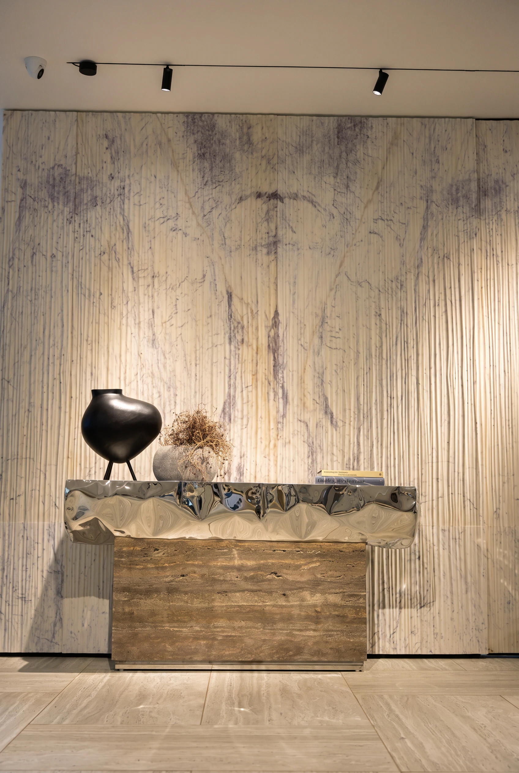
A home does not need expensive furniture or an endless collection of decorative accessories to look thoughtfully designed. Sometimes, the biggest difference comes from removing unnecessary objects, rearranging what is already available and allowing individual pieces enough space to stand out. console tables, coffee tables and open shelves may appear to be small details in an interior, but how they are styled can influence the overall atmosphere of a room.
A carefully arranged console can make an entrance feel welcoming, while a balanced coffee table can bring the living room together. Shelves, meanwhile, offer an opportunity to display books, artwork, photographs and personal keepsakes without making the space feel like a storage area. When these surfaces are styled with a consistent approach, the entire home can look more organised and cohesive.
Hardesh Chawla, founder of Essentia Home, believes that effective styling begins with editing rather than shopping. The focus should be on understanding proportions, selecting fewer but meaningful objects and leaving enough negative space around them. His recommendations offer practical ways to make everyday furniture look more refined while preserving its functionality.
How to style a console table for an elegant entrance
A console table often occupies a prominent position in a home. It may sit near the entrance, along a hallway or behind a sofa in the living room. Because it is frequently one of the first furniture pieces people notice, its arrangement can influence the first impression of the space.
According to Chawla, the most effective way to style a console is to create layers using objects of different heights. Instead of placing several accessories in a straight line, build a composition that gradually moves from taller pieces at the back to smaller, practical objects towards the front.
Start with a tall decorative element
Begin by selecting one tall object to anchor the arrangement. A mirror, framed artwork or slim table lamp can work well at the back of the console. This element establishes height and gives the remaining accessories a visual starting point.
A mirror can reflect light and make a compact entrance appear more open. Framed artwork introduces personality and colour, while a lamp can provide additional lighting in a darker corner. The choice should depend on the size of the console and the wall behind it.
Proportion is important. A large mirror may overwhelm a narrow table, while a very small frame can appear disconnected from the furniture. The aim is to create a relationship between the height of the decorative element and the dimensions of the console.
Introduce a medium-height object
Once the taller piece is in place, add an object of medium height. A vase containing a few stems, a sculptural accessory or a distinctive ceramic object can create a transition between the background and the lower elements.
Combining different shapes also makes the arrangement more interesting. For example, the straight lines of a framed artwork can be balanced with the curved form of a vase. The objects do not need to match exactly, but they should complement one another through colour, material or style.
Keep practical accessories at the front
The front section of the console can be used for smaller functional objects. A tray for keys, a small bowl for loose change or a compact dish for everyday essentials can make the furniture useful without compromising its appearance.
Chawla suggests keeping the arrangement slightly off-centre. Perfect symmetry can sometimes make a display feel rigid, whereas balanced asymmetry creates a more relaxed and natural look. This does not mean placing objects randomly. Each piece should have a purpose within the overall composition.
Equally important is leaving some of the surface empty. A console that is only partially filled can look more intentional than one covered with decorative items from end to end. The empty space allows the selected pieces to stand out and makes the arrangement easier to maintain.
Coffee table styling: Create a balance between beauty and function
The coffee table is one of the most frequently used surfaces in a living room. It needs to accommodate everyday activities such as placing cups, keeping remote controls, using a laptop or playing board games. At the same time, its position near the centre of the seating area makes it an important part of the room’s visual design.
Chawla recommends beginning with a tray to organise the decorative arrangement. A tray creates a defined area for accessories and prevents smaller objects from looking scattered across the tabletop.
Use a tray to create structure
A tray can act as the foundation of a coffee table arrangement. It groups objects together and makes the display appear deliberate. It is also practical because the entire arrangement can be moved when more tabletop space is needed.
Choose a tray that suits the proportions of the table. An oversized tray can dominate a compact surface, while one that is too small may not provide enough room for the selected accessories. Its finish can also introduce texture or complement materials already present in the living room.
Stack coffee-table books with a decorative accent
Place two or three coffee-table books on the tray and top the stack with a small decorative object. Books about architecture, photography, travel, art or design can reflect personal interests while adding colour and structure to the arrangement.
A sculptural piece, ceramic accessory or small decorative object can provide another visual layer. The combination of books and accessories introduces variations in height without making the table look overcrowded.
It is better to keep the stack limited. Too many books can make the arrangement appear heavy and reduce the available space for everyday use.
Add a natural element
A living element can soften the appearance of a coffee table. Chawla suggests adding something such as a low planter or a bowl of seasonal fruit. Both options introduce a natural detail and can make the arrangement feel less formal.
Low-profile objects are particularly useful because they do not obstruct the view across the seating area. They allow people to converse comfortably without having to look around tall decorative pieces.
Leave enough open space for everyday activities
One of the most common mistakes in coffee table styling is treating the entire surface as a decorative display. Since the table is used throughout the day, it should retain enough open space for cups, a laptop, snacks or a board game.
Chawla recommends choosing accessories that sit lower than eye level when people are seated. This helps conversations flow naturally across the table rather than being interrupted by tall objects.
Texture can also make a simple arrangement more appealing. Pairing a smooth ceramic piece with a woven basket or wooden bowl creates contrast through materials rather than relying on additional colours. Such combinations add depth while keeping the overall look understated.
How to style shelves without making them look cluttered
Shelves are often treated primarily as storage, with books and decorative objects placed wherever there is available space. However, filling every section can make a shelving unit look crowded and prevent individual pieces from receiving attention.
Well-styled shelves combine display and storage. They should accommodate useful objects while leaving enough open space to create a balanced composition. The two-thirds rule is one practical way to achieve this.
Follow the two-thirds rule
The two-thirds rule suggests filling roughly two-thirds of the available shelf space and leaving the remaining portion empty. This creates negative space around the displayed objects, allowing the eye to focus on individual pieces instead of seeing one continuous collection.
The empty sections are just as important as the objects themselves. They prevent the arrangement from looking crowded and give the shelving unit a more relaxed appearance.
The rule does not need to be followed with mathematical precision. It is a guiding principle that can be adapted according to the size of the shelves, the number of objects and the overall interior style.
Mix horizontal and vertical book arrangements
Books can provide structure and rhythm when arranged in different directions. Instead of placing every book vertically, combine upright rows with horizontal stacks.
Vertical arrangements create height, while horizontal stacks introduce a different visual pattern. A small decorative object can also be placed on top of a stack to create another layer.
Consider the size and appearance of the books when arranging them. Grouping books thoughtfully can make a large collection look organised without requiring every spine to follow an identical colour scheme.
Arrange accessories in groups of three or five
Chawla recommends grouping decorative objects in odd numbers. Arrangements of three or five pieces often feel more organic than pairs because they allow greater variation in height, shape and placement.
For example, a small sculpture, a ceramic bowl and a decorative accessory can form one group. The objects can have different shapes while sharing a similar material, colour or design language.
Odd-number groupings are not a strict requirement, but they offer a useful starting point when arranging smaller objects on shelves.
Layer artwork, frames and smaller objects
Layering can give shelves a greater sense of depth. Place a framed photograph or artwork towards the back and position a smaller object in front. This creates a more dimensional arrangement than placing every accessory in a single row.
However, the objects should remain visible. A large accessory placed directly in front of a smaller one can hide the details that make the display interesting.
Use repeated colours and materials
A shelving unit can contain a variety of objects without looking disconnected. One way to create cohesion is to repeat a colour or material across different shelves.
For example, brass accessories, timber finishes or stone objects can appear in separate sections of the unit. These repeated details connect the arrangement and help it look like one composition rather than a collection of unrelated pieces.
Add greenery and meaningful personal objects
A plant or a piece of trailing greenery can soften the straight lines of shelves. Greenery introduces a natural element and adds variation to displays dominated by books, frames and hard decorative objects.
Personal objects are equally important. Travel souvenirs, family photographs and handmade pieces can make a shelf feel connected to the people living in the home. Rather than filling every space with generic accessories, choose a few items that carry memories or reflect individual interests.
A styled shelf should look considered but still feel lived in. The aim is to create a display that reflects personal character rather than reproducing a showroom arrangement.
How to create a cohesive look across different surfaces
Console tables, coffee tables and shelves may serve different purposes, but their styling should share a common visual language. When each surface follows a completely different colour scheme or decorative style, the room can feel disconnected.
Chawla recommends choosing a limited palette of two or three tones, repeating materials such as brass, timber or stone, and varying the height and scale of objects. These principles help create consistency without making every arrangement look identical.
Choose two or three complementary colours
Begin by looking at the colours already present in the room. Furniture, flooring, curtains, rugs and wall finishes can provide a starting point for selecting decorative accessories.
Choose two or three complementary tones and repeat them across the different surfaces. This creates a subtle connection between the console, coffee table and shelves while allowing individual objects to retain their character.
Repeat materials for visual continuity
Materials can connect different areas of a room just as effectively as colours. A wooden bowl on the coffee table, a brass accessory on the console and a stone object on a shelf can create a relationship between the surfaces.
The pieces do not need to be identical. Repeating a material or finish in different forms is enough to create a sense of continuity.
Vary scale, height and texture
Consistency does not mean using accessories of the same size everywhere. In fact, an arrangement can look repetitive if every object has an identical height or shape.
Varying proportions creates visual interest. Combine taller statement pieces with medium-sized accessories and smaller functional objects. Different textures, such as smooth ceramic, woven materials, natural wood and stone, can add depth without making the colour palette complicated.
Why editing is the most important part of home styling
Before buying new decorative accessories, it is worth examining what is already on display. Some objects may no longer suit the room, while others may be competing for attention or making a surface difficult to use.
Removing unnecessary items can reveal the furniture’s original design and proportions. It also helps identify which pieces deserve to remain visible. This approach can refresh a room without requiring a major investment in new furniture or accessories.
Chawla explained that, as a maker, he pays close attention to the depth, height and proportion of a surface. These details can easily be hidden when a tabletop is crowded with decorative objects.
He said, “Styling begins with editing. As a maker, I see how much thought goes into the depth, height and proportion of a surface, and that is the first thing a crowded tabletop hides. Choose fewer, better pieces, give each one room, and the furniture looks more refined, and the home feels calmer.”
His advice highlights an important distinction between decorating and styling. Decorating often involves selecting objects to improve the appearance of a room, while styling also considers how those objects relate to one another and the space around them.
Common mistakes to avoid when styling home surfaces
Even attractive decorative pieces can make a room feel cluttered when their size, placement or quantity is not considered. Keeping a few common mistakes in mind can help maintain a balanced look.
- Filling every available space: Crowding a console, coffee table or shelf leaves little room for individual objects to stand out.
- Ignoring proportions: Oversized accessories can overwhelm small furniture, while very small objects may appear disconnected from larger pieces.
- Prioritising decoration over function: A coffee table should retain enough space for everyday activities, and a console should remain useful for small essentials.
- Using too many unrelated colours: An excessive mix of tones can make different surfaces feel disconnected.
- Making every arrangement identical: Consistency is useful, but repeating exactly the same display everywhere can make a home feel overly staged.
- Forgetting personal details: A home filled only with generic decorative accessories may look polished but lack character. Meaningful objects make the space feel more personal.
Simple styling choices can make a home feel more refined
Styling console tables, coffee tables and shelves does not require a large collection of accessories or an expensive interior makeover. The most effective approach begins with understanding how each surface is used and selecting objects that support both its function and appearance.
A console table benefits from layered heights and balanced asymmetry. A coffee table needs a defined decorative arrangement while retaining enough room for everyday activities. Shelves look more considered when books, artwork, greenery and personal objects are displayed with sufficient negative space.
Across all three surfaces, a limited colour palette, repeated materials and thoughtful variations in scale can help create a cohesive interior. Most importantly, leaving some areas empty allows the furniture and its carefully selected accessories to stand out.
As Chawla’s advice suggests, a well-put-together home is often the result of thoughtful editing rather than constant shopping. Choose fewer pieces, give them room and let the furniture’s proportions become part of the design.
For breaking news and live news updates, like us on Facebook or follow us on Twitter and Instagram. Read more on Latest Lifestyle on thefoxdaily.com.





COMMENTS 0